
On Wabi-Sabi Color Choices
I’m sure many of us are looking for a little Spring refresh, especially as we’ve been cooped up in our homes for going on a month now. We’re still taking plenty of paint orders in the shop and supporting our clients with virtual color consultations so they can freshen up their spaces while staying safe and healthy at home.
If you saw our last post, you’ll know that the Japanese concept of wabi-sabi holds a deep reverence for nature and witnessing the beauty and calm of the cyclical changes of nature. When striving to create a wabi-sabi home, a calm backdrop of nature-inspired colors is the perfect stage to showcase the special, meaningful pieces that add meaning to your life.

This calming scheme of soft whites, creams, and neutrals sets is one we created for a client’s meditation studio. The perfect, serene backdrop for a true wabi-sabi home.
I’ve put together a list of some of our favorite Farrow & Ball colors if you’re looking to inject some serenity into your home, with a focus on warm neutrals, greens, blues, and grays. All of these colors are available in a variety of finishes for pickup or contactless delivery from us at AMPERS&. Simply call the shop, shoot us an email, or DM us on instagram to order.
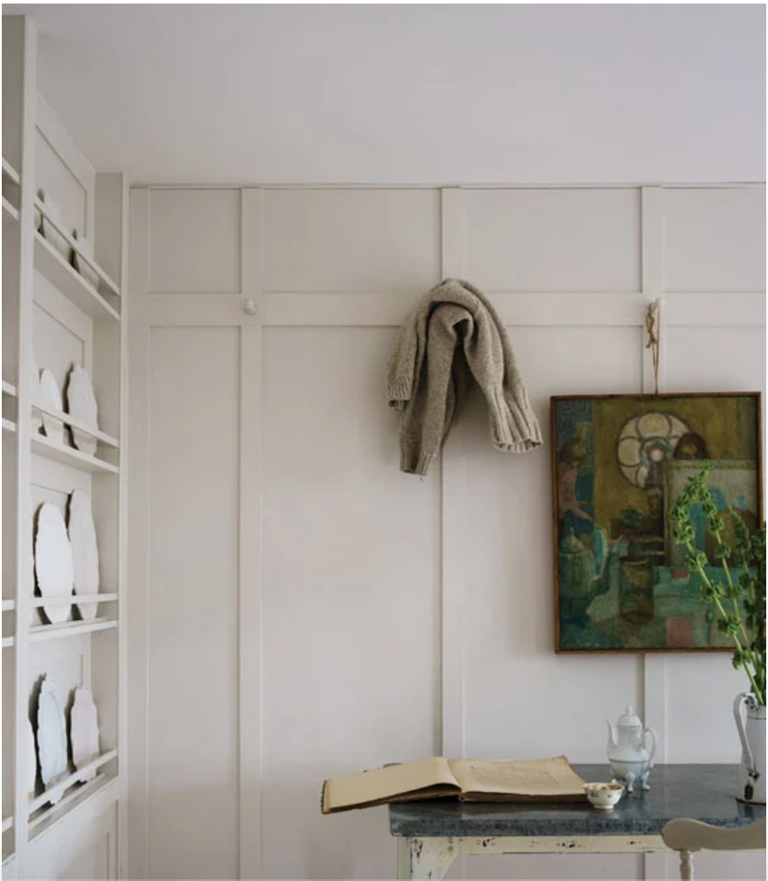
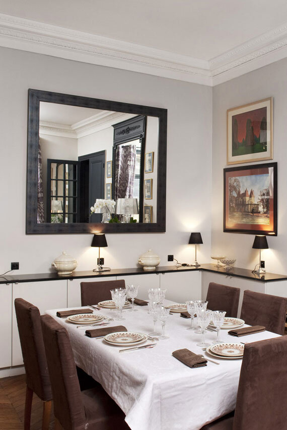
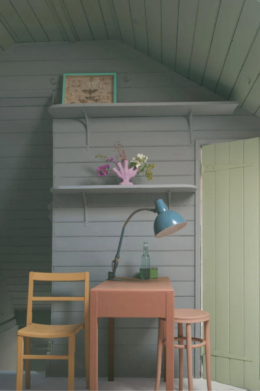
Whites and Neutrals: these shades make for a decidedly un-fussy palate to let precious objects and functionality take center stage. Pictured above is a design scheme we worked up for a client’s meditation room concentrating on a soothing palette of creams and neutral browns.
A few of our Farrow & Ball favorites in this category are School House White, Skimming Stone, and Jitney.
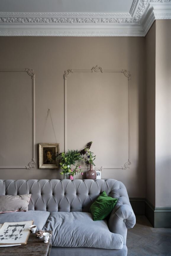
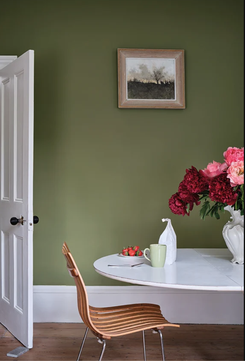
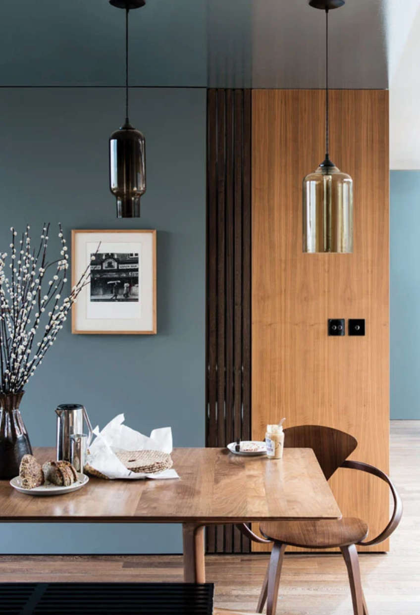
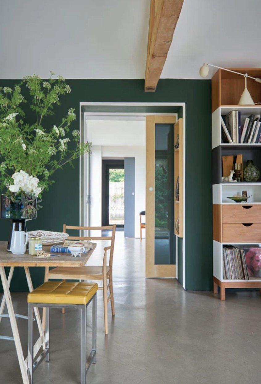
Earthy Blues and Greens: calming, cooling colors taken from nature around us infuse a space with serenity. Don’t be afraid to branch out and try soft blues and greens to bring life to a simpler room or forgotten piece of furniture!
Some Farrow & Ball favorites are Sap Green, Cromarty, De Nimes, and Studio Green for a strong statement.
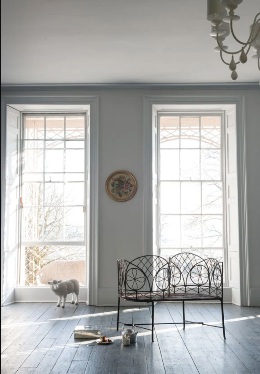
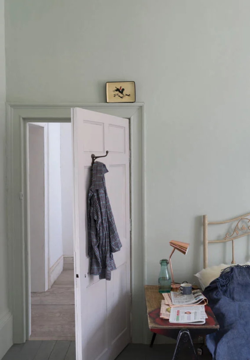
Grays: rich, complex grays lend strength and structure to a room and F&B truly excels with these shades, which are never too cold.
Farrow & Ball’s Dimpse, Manor House Gray, and Railings are no-fail picks.
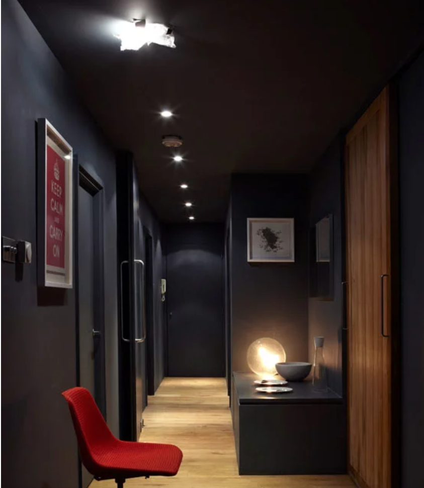
I.mages below taken from Farrow & Ball’s website